The BC Hockey League has had some fantastic and unique jerseys over its 60-year history. Some were questionable, which I covered in a previous article. This one will cover each of the 18 BCHL teams’ best jerseys from 1990 to the present, which follows the same criteria as the questionable jerseys.
As always, a discussion like this is entirely subjective as these thoughts are strictly my opinion on these jerseys.

Alberni Valley Bulldogs
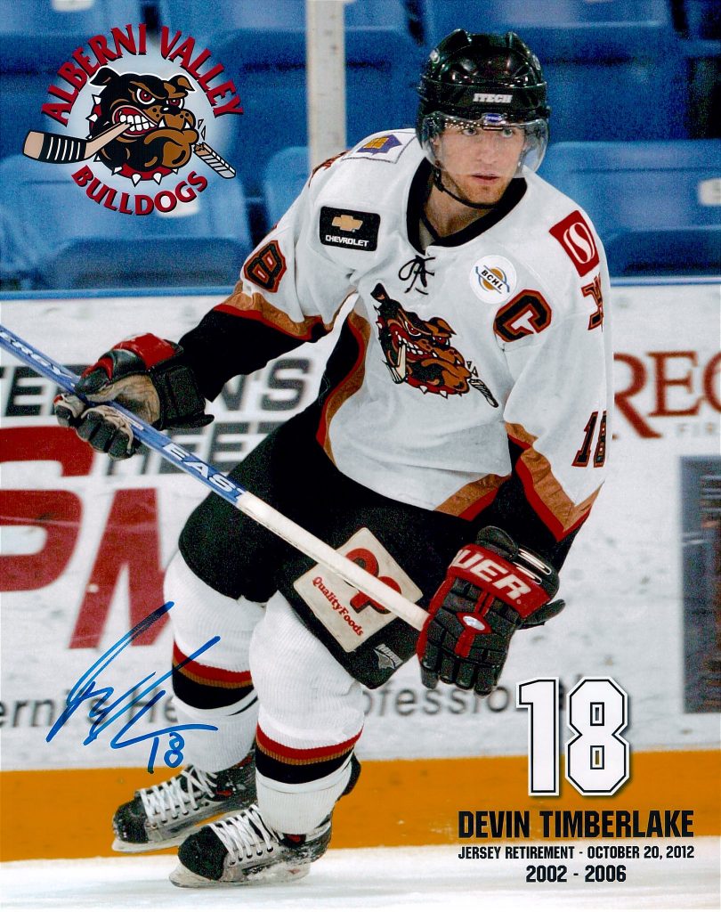
Alberni Valley has some fantastic jerseys but they are from their days in Burnaby. The color scheme of black, copper, and red was carried over in the move to the Island and included a revamped shoulder patch of an “A” and “V” overlapping.
The jerseys themselves are just classic with the black, copper, and red triangles on the sides. The sleeves have the same design similar to the New York Rangers “liberty” jerseys. These jerseys are the Bulldogs’ best.

Chilliwack Chiefs
For the Chilliwack Chiefs, this is a no-brainer. Pretty much any Chiefs fan will agree that the iconic ‘rage’ jerseys from 1998-2004 are the best. The Chiefs went from a traditional look in the mould of the New York Rangers/old Winnipeg Jets to an intimidating yellow and black with spike striping in the style of the Calgary Flames of the same era.
The Chiefs had their most successful run in these jerseys, going to four Fred Page Cup finals in five years. They won two BCHL crowns, picked up a Doyle Cup win in 2002, and made two appearances at the RBC Cup.

Coquitlam Express
Coquitlam has gone through a few changes over its 20 years in the BCHL. The best Express jerseys come from 2006. The white jerseys were the same style as the original blue jerseys, but with the new intimidating train logo on them.
The black jersey was much more simple. It featured the same jersey design as the white but with ‘EXPRESS’ diagonally across the front – an underrated classic look. Even though the jerseys didn’t match completely, they both are the best jerseys in Express history.
Cowichan Valley Capitals
 The Caps have followed the Washington Capitals jersey styles for most of their existence including their logo. In 2006-07, the Capitals had a jersey that was unique, simple and the best jersey they have come up with.
Starting with the logo, a ‘C’ and ‘V’ formed to shape a seahawk-style head. The jersey was the same design as the New York Rangers liberty third jersey of the same era. The “seahawk” logo came back as a shoulder patch in 2013-14 but hasn’t made an appearance of note on the Capitals jerseys since.

Cranbrook Bucks
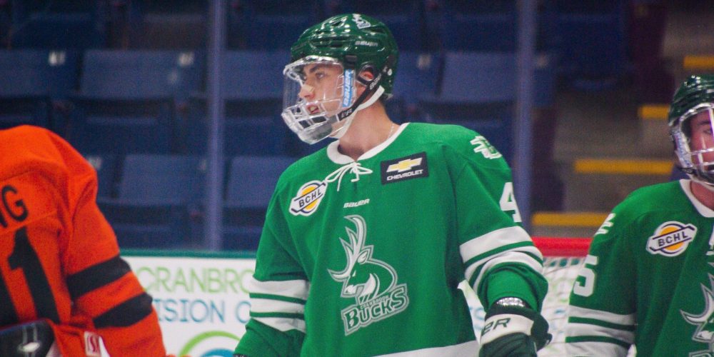
The Bucks are the newest franchise in the BCHL. They only have one set of jerseys, which is very well done. The buck print shoulder patch is unique and one of the best in the league.
This was a fantastic Langley Hornets Jersey that ended on eBay earlier tonight. Love the retro BCHL logo. pic.twitter.com/VoVjVGPyrf
— James Beaverman (@jamesbeaverman) February 22, 2021
Langley Rivermen
The Rivermen over the last 10 years has only had one jersey design. I’m going to go with the Langley Hornets. The Hornets rebrand from the Thunder in 1998 swapped the green for yellow in the color scheme.
The jerseys were a design inspired by the Buffalo Sabres of the same era. The hornet logo both on the front and shoulder is one of the best in BCHL history and very unique.

Merritt Centennials
The Cents have had a lot of great jerseys over the years. But the best is definitely the return to their classic look in 2007-08. They went from a maple leaf wordmark back to the classic turntable “C” logo and with traditional striping similar to the Chicago BlackHawks. It’s one of the best classic remake jerseys in the BCHL.

Nanaimo Clippers
This jersey comes to us from the early 2000s. These in my opinion are Nanaimo’s best – other than maybe the jerseys from the 80s. These were part of my top five jerseys in BCHL history.
The road jerseys are black with orange, white, and silver borders around the arms and stripes on the bottom. It features the classic Clippers logo in the middle and the clipper ship on the shoulder.
The home whites mirrored the road jersey, adding black stripes to the arms and a black stripe on the bottom. Nanaimo won the Fred Page Cup in 2004 and 2007 and made the final in 2008.

Penticton Vees
Penticton is the standard when it comes to producing excellent jerseys. Other than their first jersey from the rebrand to the Vees, each jersey has been outstanding. The jersey the team wore in 2011-12 is definitely the best they have come up with.
I’m sure I get some flack from few fans of the Vees for this, but the home whites with black shoulders and black cuffs with two blue stripes and a white stripe in the middle look great. Throw in the addition of the City of Penticton logo to the left shoulder and the 35th-anniversary patch on the other. and you’ve got a masterpiece.

Powell River Kings
Powell River has only really one bad jersey, that being their early 2000s jersey with the Dallas star look and the crown under the word “KINGS”. Their best jersey is their current one, a throwback to their Paper Kings days with the big “P” with the crown in the middle.
The green and yellow color scheme with white and black accents are excellent. As I had in the reverse retro article, I hope they come out with a throwback to the actual Paper Kings jersey, but with the current colors.

Prince George Spruce Kings
Prince George has had two main looks over the last 30 years. Their iconic spruce tree jerseys, and their New York Rangers style. Their current jerseys, which is a rework of their original jerseys, are their best.
The blue road jerseys feature white and red stripes on the sleeves and bottom. The whites have blue shoulders with red stripes on the bottom and red and blue striping on the sleeves and bottom of the jerseys.
The revamped logo to incorporate blue along with red and white plus the addition of the wordmark logo as a shoulder patch is a very nice touch
Salmon Arm Silverbacks
The Backs have pretty much had the look of the Los Angeles Kings for all but one jersey. Their best jersey is the very first jersey they came out with for the 2001-02 season. It has a black base with purple shoulders and thick stripes on the sleeves and bottom.
There’s silver trim around the purple shoulder and stripes. They added a silver sparkle to the back of the gorilla logo to indicate that it was a silverback. I hope there’s a return of these threads in the future.
Surrey Eagles
The Eagles have had some pretty good jerseys over the years. Their best is the jerseys they came out with in 2003-04. It had a navy blue base with green stripes separated by a thin white stripe in the middle.
The shoulder patch is similar to Toronto Maple Leafs’ three-letter shoulder patch from 2001-07, except instead of “TML” the patch was “SSE” to represent “South Surrey Eagles.
The white jerseys had New York Islanders striping with one green and one blue thick stripe on the sleeves and the arms and the same shoulder patch with one ‘S’ in green, a second ‘S’ in white, and the ‘E’ in green.
#TbT #ThrowbackThursday – It's #Trail native @travis_stdenis with @BCHLSmokeEaters in 2010 @QUAthletics pic.twitter.com/3C4eoii5MQ
— BCHL (@BCHockeyLeague) December 11, 2014
Trail Smoke Eaters
Trail has had some fantastic jerseys over the years given its long history of senior and junior teams. The Smoke Eaters’ best jersey in the BCHL is their Philadelphia Flyers-inspired jerseys. It’s a black base with white blocking on the shoulders that comes down to wrap around the elbow/forearm area.
There’s an orange trim around the white blocking and the orange stripe in the middle of the white around the forearm. The white mirrored the black with orange shoulders coming down from the shoulders and featured black trim. The updated logo kept the smokestacks but removed the smoke and added a hockey stick under the stacks.

Vernon Vipers
Vernon’s best jerseys come from 1996. It’s a Florida Panthers-inspired jersey with the Vipers logo that is the best the team has had. The red jerseys had navy blue and yellow trim and white accents.
There’s not much to them but for a team like Vernon, it is a match made in heaven. The Vipers won the 1996 Fred Page Cup, Doyle Cup, and the Centennial Cup while wearing these.
They switched out of these jerseys to an unconventional jersey with triangle stripes on the cuffs and sides before switching to Atlanta Thrashers-style jerseys in 2002.

Wenatchee Wild
Wenatchee has a small selection of jerseys in its young BCHL history. Their best jersey was their inaugural jersey when they came in from the North American Hockey League.
They are inspired by the Stanley Cup Champion Tampa Bay Lightning with a royal blue base and thick white stripes on the sleeve and bottom. The white jersey mirrors the blue. The shoulder patch featured a howling wolf which eventually became their main logo. It’s one of the best logos in the BCHL.

West Kelowna Warriors
West-K is one of the few teams that could have five different jerseys at one time. Their best is the new jersey they introduced in the 2019-20 season. It’s black with a cream stripe in the middle with red trim.
The shield logo that was first a shoulder patch is the best logo they’ve come out with. The light jersey is a cream-coloured version with a red stripe in the middle with black trim around it.
My hope is the Warriors stick with these jerseys and eliminate the other three extra jerseys.


